|
Help Us
Locate These Missing Children
10 Most Popular Sites for Fashion
|
Bridge
to the Future, Inc.
a Michigan based 501c3 non-profit organization
since 2000
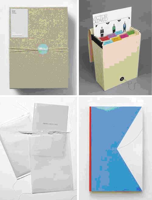
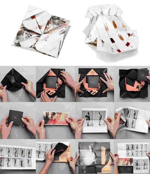
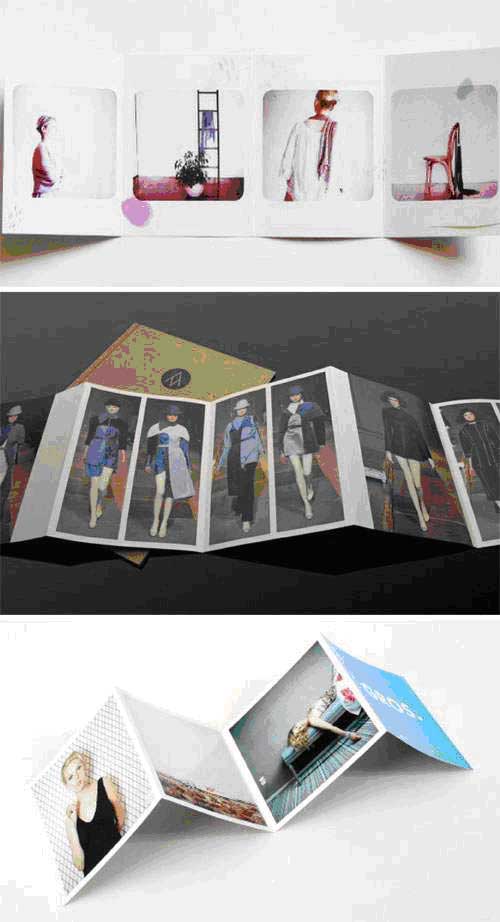
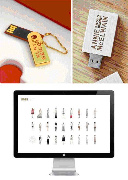
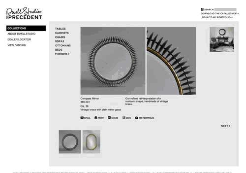
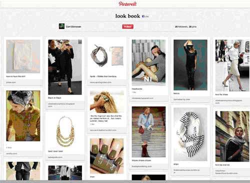
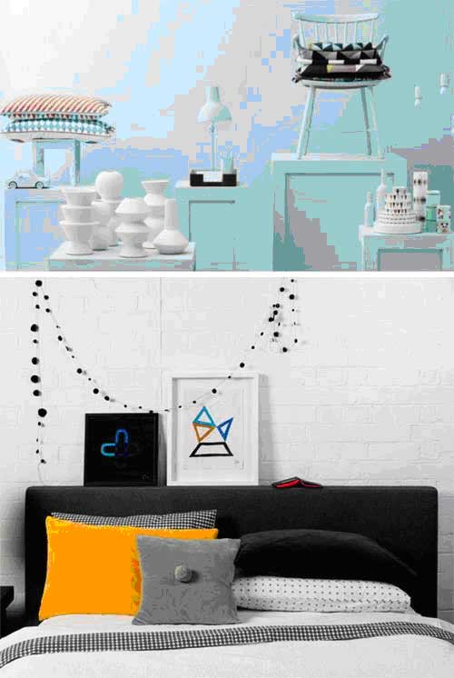
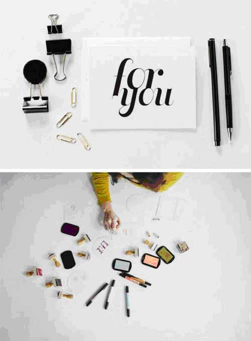
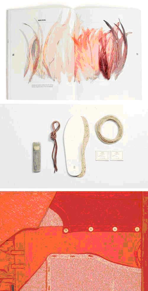
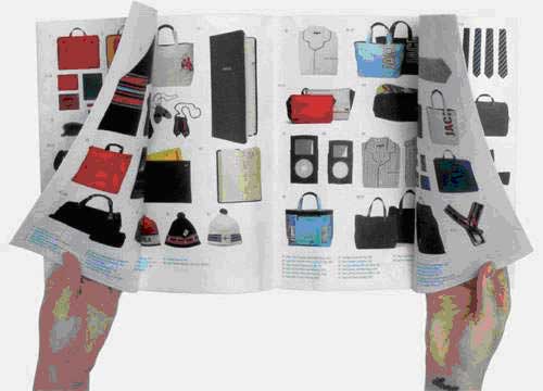
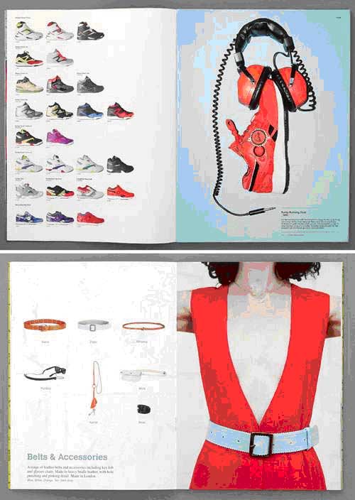
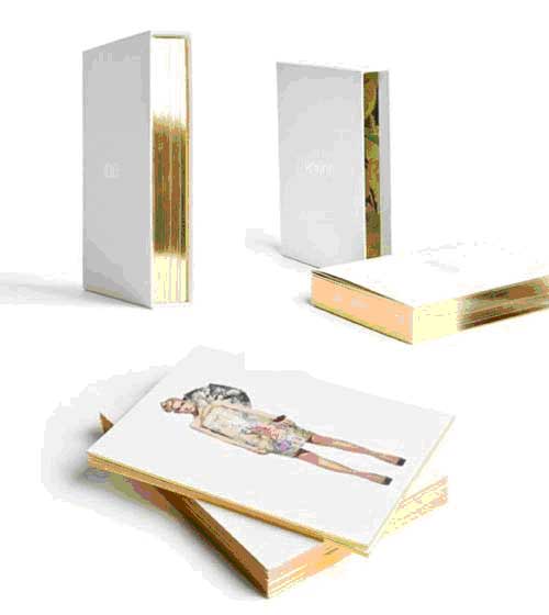
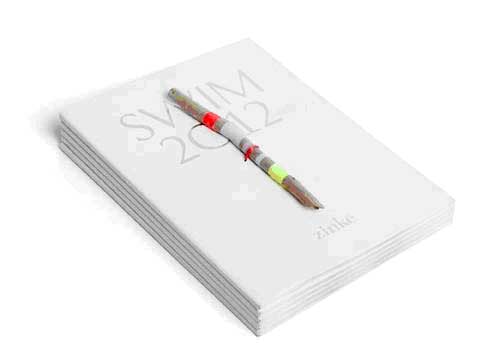
The Value of Look Books by Chloé Douglas As a designer, photographer or retail expert, you may work on the creation of these nuggets of style. As an editor, retailer or buyer, you may have hundreds of look books cross your desk each year. Or perhaps you are just a lover of design and look books tickle your fancy! Whatever category you fit into, look books are a vital marketing tool that showcase personality, enhance a brand and make a line of products memorable. When I started my blog over a year ago, I had no idea I would be emailed so many look books and product PDFs. I have been fascinated by the range of style and quality from dimly lit photographs and Comic Sans to huge hyper-retouched catalogues. Frankly, both are no good. You may have the most gorgeous products out there but if you snap some photos in your kitchen on a cloudy day and throw them in a PDF with a frightening typeface, your first impression is not enhancing your work. Magazine editors, blog owners and retailers can’t see what you have crafted properly and will likely be put off by an unpolished first impression. Same goes for overly Photoshopped, abstract look books that are trying so hard to be artistic that the products are almost distorted (some fashion houses might get away with that but proceed with caution!) Recently, I was emailed a PDF of some kitchen accessories that looked rather intriguing in pattern and style. However, the mini look book I received had very low resolution, dim images along with bursts of orange type that extended onto the photographs. While the products had potential, I had no intention of posting the poor images I was sent (does this make me a snob?) I fear the maker of these items may not get the attention she deserves because the first impression was one of low quality and out of touch design. Often times, a look book speaks for you and your products without the benefit of you being there or providing a sample piece. On the desk of an editor, in the inbox of a blog curator, carried out of a trade show with stacks of competitors – your book needs to showcase your line and brand in the very best light possible. Look books exist in many forms these days including print, transportable USB’s, websites, videos and innovative materials. I feel as though there is resurgence of interest in this cornerstone of retail design which is rather exciting because it is so full of opportunity for great design and product line enhancement. Let’s ponder some examples! The design of a look book says so much before it is even opened so be sure to explore tactile features, brand details, dashes of colour, unique envelopes/closures, folder systems, binding styles, etc. I love look books that use a brand or product detail in a unique way such as wrapping the book cover in a pattern from the season’s collection. Budget will be a deciding factor but there are endless impactful yet cost-effective designs you can utilize. I continue to see the mini-trend pop up. A beautiful and memorable look book design that will almost certainly become a keepsake. Accordion print look books are often popular as they are easy to reference and cost-effective (especially versus complicated book binding) and provide two distinct surfaces to play with. Along with accordion styles, explore the many avenues of fold out designs. I would love to see a look book created as a fan. Perhaps for a resort collection or summer-oriented product line? USB or flash drive look books remain popular for many brands and product lines. USBs are easy to transport and mail to perspective retailers and are also great for press because images can be taken off and used for features. They may not have the same tactile feeling as a print piece but there is still plenty to customize including unique, custom flash drive packaging and the fabulously designed look book itself. I like working on PDF look books as they allow for so many engaging, interactive components. We’ve talked about packaging, design and medium choices but there is one essential component of look books still on the table – photography and styling. As discussed earlier, how your work is presented is vital to the success of your products. Research and experiment until you have found an aesthetic that will speak for your brand and find a photographer/stylist that can bring that to life. It is a critical step. Remember that you can reuse these images for your website, advertising and other design needs. From a monochromatic powder blue set to a cheery stylish bedroom, I love the above look books of interior products as they showcase their wares handsomely and also speak to a larger brand identity. Perhaps your product line is small or your pieces require more detailed photography. There are so many options for styling dynamic imagery beyond the regular overhead shot. Whether it be hanging duvets to showcase a luxurious, billowing fabric or artfully arranging shoe laces, a properly styled product photograph can make an item leap off the page and highlight the detailed craftsmanship of your work. I love this example of a look book for stationery studio Our Paper Shop as it shows how a product category can benefit from a distinctive look book. Many stationery and paper good companies create similar simple imagery but Our Paper Shop has a look book full of both product and brand shots. I love how this image of one simple greeting card is so well styled and sits alongside a beautiful brand shot of stamps that speak to the handmade, design-oriented soul of the company. As you design a look book, think about showcasing the materials, colours, fabrics, textures and overall details required to create a product. Those details not only underscore your inspirations but speak to quality and craftsmanship. I have noticed more and more brands using these images and they are always among my favourite photographs in a look book. Shown at top are hand-dyed feathers used by a luxury hair accessory designer and at bottom, the colour palette of a sportswear collection shown as a geometric still life shot. I like this Jack Spade look book as every item is shown with catalogue simplicity yet artful atyle. The clean brand feeling is preserved and every product is on display. Similarly, I like when brands and makers mix a page showing product variations with a page of pure editorial brand style. It really is the best of both worlds! Remember that a look book can be valuable for service-oriented businesses too. While a portfolio shows rigid examples of work, a look book can give a potential client a stronger feeling of who you are and your overall style (as shown above in a look book created for photographer Max Wanger). Remember your target market and how you can stand out amid a sea of competitors. Simply because a style is popular doesn’t mean you should follow the status quo. I love this look book created for fashion line Honor and its opulent box of gold edged cards. Without showing one price, the brand already feels luxurious and high-quality. I think the loose card idea is a great chance for buyers to visualize the products and could be easily translated into other budget ranges. My very favourite look books are those that add a detail that is unique to that maker or brand. More specifically, I love a piece of the process itself whether it be a swatch of fabric, a square of resin or an online gallery of behind-the-scenes shots. Zlinké’s 2012 swimwear collection was inspired by natural beach materials so the printed look books had a piece of drift wood, hand-painted in the collection’s colour palette, tied to the cover. Simple (and not expensive) yet beautiful and memorable. If you are creating a printed look book, ponder what you could include that would be tactile and special (and save those workroom scraps just in case!) I will end my examples there so I don’t ramble too far off the deep end. There are so many inspiring look books across all price ranges so creating one that works for your line need not be super expensive or stressful. If your talents do not lie in photography, art direction or styling, hire the best photographer and designer you can afford (or pester your talented friends). Consider your target market and what medium will work best to reach the best contacts. Remember that pieces of your look book can also be reused for your website, promotional pieces, press kits and so forth. Also, the cost of production will likely be recouped in sales once buyers have a gander at your stunning finished product. If your budget is extremely wee or your line is small, focus on creating a small but mighty PDF with clear photographs. Believe me, it makes a big impact. While look books seem to dominate the fashion industry, they have plenty of value in many other streams of retail. With a great book in hand, focus your attention on crafting a list of retailers, blogs and press to send it to. I am certain the investment in enhancing how your brand and products are perceived will be worth it. You need to be memorable in a sea of other look books and promotions. Creating products and a brand are a ridiculous amount of work. Don’t drop the ball just before you cross the finish line (is that a mixed analogy?) Your look book is you in digital or paper form and it must always speak to the image you want to project and show your products off in the very best light possible.
Bridge to the Future, Inc. helping encourage and educate since 1998. We have sponsored designers of Detroit Fashion Week and youth programs which enhance fashion careers in design, styling, makeup and modeling. <form action="https://www.paypal.com/cgi-bin/webscr" method="post"> <input type="hidden" name="cmd" value="_s-xclick"> <input type="hidden" name="hosted_button_id" value="23S8J3ZQ724LW"> <input type="image" src="https://www.paypal.com/en_US/i/btn/btn_donateCC_LG.gif" border="0" name="submit" alt="PayPal - The safer, easier way to pay online!"> <img alt="" border="0" src="https://www.paypalobjects.com/en_US/i/scr/pixel.gif" width="1" height="1"> </form> . For your donation we will send via email you our 19 page ACTING 101 manual that is used worldwide in character building programs. It is the same guide we use in our acting coach workshops for kids, teens and adults. |
|
Mission Statement Bridge to the Future, Inc. works to introduce youth to the arts through film, art, fashion, and visual media. We are committed to youth and adults working together to create an environment of positive outlets to express their ideas. Our approach includes hands on training, counseling and exposure to the entrepreneurial concept of becoming a creative artist using tomorrows technology. Our mission includes helping them to understand their role as leaders in their communities. |
